
Designing for Success | Embracing SharePoint Best Design Practices
Maintaining communication, collaborating, and sharing documents and news can quickly become overwhelming in a digital world. SharePoint has been a lifesaver for modern work for decades, bringing organizational assets into one centralized location, boosting efficiency, and helping us learn from each other. But setting up SharePoint haphazardly and skipping the design best practices turn it from a savior to a stressor for the organization. Our team has designed and built hundreds of successful SharePoint intranets over the years, and today we’re sharing some of the most important design best practices for SharePoint so you can start with a solid foundation.
Defining the purpose of your SharePoint site
Defining the purpose and your goals for building a SharePoint site and specifying why you need the platform in the first place is the first step of building an effective SharePoint site. Defining a purpose for your SharePoint acts as the North Star that guides every design decision and feature selection.
When the purpose is well-defined, it sets the tone for how SharePoint will be structured and customized to meet your organization’s unique needs. A purpose-driven SharePoint aligns your team’s efforts and helps users by adding value to their daily work.
Build with the user in mind
Designing a SharePoint site is a lot like operating a business. Just as you’d identify your target market and tailor your product or service to meet their specific needs before establishing your company, the same approach applies to SharePoint. It’s essential to constantly prioritize our users and make decisions while keeping the best interests of our primary stakeholders in mind.
We should consider both content creators who contribute to the site and visitors consuming and engaging with the content. We do this by first understanding what they seek and how they intend to use the intranet. It’s crucial to consider the desires of each user and their potential contributions to the platform’s success.
Creating a user-friendly experience
Crafting a user-friendly experience on SharePoint ensures smooth navigation and optimal user engagement. Incorporate the following strategies into the design and development of your SharePoint site and significantly enhance its user-friendliness:
Conducting a content audit
Before diving into the construction of your SharePoint site, it’s crucial to understand what content will live there. A content audit categorizes and evaluates existing content to understand its scope and relevance. By determining content categories, you can structure an effective information architecture that simplifies content organization and retrieval. This content categorization serves as a foundation for designing a streamlined user experience.
Establishing information architecture
Enlightened with insights from the content audit, we can now construct an information architecture that aligns with user expectations. Organizing content based on the identified categories ensures we logically group content and that relationships between different components are clear. A well-organized information architecture not only facilitates content management but also aids users in quickly discovering the most relevant and up-to-date information.
User-focused navigation
Next, reimagine navigation based on user needs rather than strictly following the organizational hierarchy. Develop a navigation system that intuitively guides users to their desired content and uses clear labels and categories that resonate with users’ mental models, making it easier for them to locate relevant content without unnecessary clicks.
Enhancing content discovery
Implementing robust search functionalities and filters helps users find the content they need easily. Leverage metadata and tags assigned during the content audit to enable accurate content retrieval. This empowers users to swiftly locate the information relevant to their tasks, enhancing their productivity.
Streamlining user experience
Simplicity is key when it comes to user experience. Design the interface with a user-centric approach and store content in easily accessible locations. Minimize clutter and unnecessary elements to create a clean and intuitive interface. Prioritize readability and visual clarity to enhance user comprehension.

Best design practices for creating SharePoint pages
When it comes to creating engaging and effective SharePoint pages, a well-thought-out design is key. Ensuring a user-friendly experience while maintaining a consistent and visually appealing look can greatly enhance the impact of your content. Here are some essential design practices to consider when building SharePoint pages:
Title and URL for easy navigation
Start with the basics. Use relevant and descriptive titles and URLs for your SharePoint pages. Clear titles help users understand the content at a glance, while user-friendly URLs make navigation smoother.
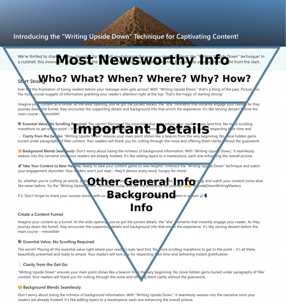
Writing upside down
Consider an innovative approach to content presentation—writing upside down. In a nutshell, this innovative approach flips the script on traditional content organization to captivate your audience right from the start. Placing essential information at the top of the page immediately captures readers’ attention and ensures they grasp the main point. Imagine your content as a funnel. You’ve got the juiciest details at the top, the “aha” moments that instantly engage your reader. As they journey down the funnel, they encounter the supporting details and background info that enrich the experience. It’s like serving dessert before the main course—irresistible!
Effective use of headings and subheadings
Organize your content with a clear hierarchy using headings and subheadings. This approach enhances readability and helps users quickly locate the information they seek. Break up lengthy text blocks to create a more scannable and user-friendly layout.
Consistent branding
Maintaining consistency in branding is vital. Ensure that your SharePoint pages align with your organization’s branding guidelines by using consistent colors and logos across all pages to establish a cohesive and professional appearance.
SharePoint does not currently allow users to alter the fonts within their content. As a result, strategically leveraging the provided font styles is essential for designers, especially when aiming to establish a clear information hierarchy.
High-quality images
Incorporate relevant, high-quality images that complement your content. Steer clear of overused stock photos, opting for visuals that resonate with your audience and enhance the overall page aesthetics.
Use white space
Effective SharePoint design relies heavily on a lot of open space to juxtapose bolder areas across application layouts. Use white space to guide readers’ attention and create a harmonious layout strategically. Use white space to break up text and create a clean, uncluttered look inviting users to explore your content easily.
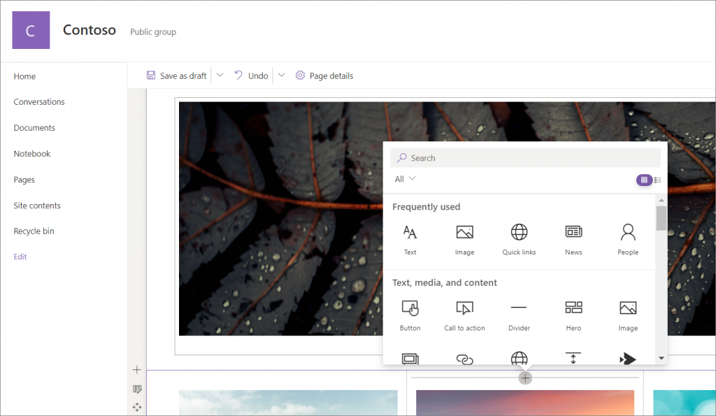
Incorporate web parts
Integrating web parts within your site can offer an enriched user experience and a dynamic platform for sharing information. By embedding web parts, you can bring in external content, display interactive elements, and create versatile layouts that cater to diverse content types. This doesn’t only enhance engagement but also fosters a seamless flow of information for users. Here are top 5 most used web parts that you can incorporate into your SharePoint pages:
- Text web part: The Text web part serves as a fundamental tool for presenting textual information. It allows you to insert and format text content, providing explanations, descriptions, and context within your SharePoint pages. This versatile element supports rich formatting, making it suitable for diverse content needs.
- Image web part: The Image web part empowers you to include visual content that complements your textual information. Whether it’s showcasing product images, infographics, or photographs, this web part brings a visual dimension to your SharePoint pages, enhancing their appeal and engaging users.
- Link web part: The Link web part plays a crucial role in directing users to external sources, internal pages, documents, or any online content. By integrating relevant hyperlinks, you enhance the accessibility of related resources and allow users to navigate seamlessly within your SharePoint site.
- News web part: The News web part is particularly beneficial for sharing updates, announcements, and important information with your audience. It enables you to display news articles, blog posts, and other time-sensitive content in an organized and visually appealing manner.
- Hero web part: The Hero web part offers an eye-catching and dynamic way to introduce content. It allows you to create visually appealing banners or sections with background images, titles, and descriptive text. This web part is perfect for highlighting featured articles, events, or key messages on your SharePoint pages.
Incorporating these design practices into your SharePoint pages can significantly elevate their impact and engagement. A seamless user experience, combined with a visually appealing and well-structured layout, enhances the effectiveness of your content and contributes to a positive user interaction.
Ensuring accessibility in SharePoint design
Accessibility in design is crucial to ensure that all users, regardless of their abilities, can effectively engage with and benefit from the content and functionality of a SharePoint site. Addressing the diverse needs of individuals with disabilities promotes inclusivity and enhances the platform’s usability and effectiveness.
Different disabilities can impact users’ interaction with an intranet. These include visual impairments, physical limitations, auditory difficulties, cognitive or neurological challenges, and situational obstacles. Recognizing and accommodating these various disabilities is fundamental to designing an intranet that caters to a broad audience.
Understanding accessibility
Accessibility revolves around creating products, services, and environments that cater to the broadest range of capabilities. In web design, including SharePoint, the World Wide Web Consortium (W3C) defines web accessibility as designing and developing websites, tools, and technologies that enable people with disabilities to use them. This encompasses the ability to perceive, understand, navigate, interact with, and contribute to the web.
Guiding principles of WCAG
Content Accessibility Guidelines (WCAG) offer a comprehensive framework for ensuring accessibility organized into four main principles:
- Perceivable: Present content in ways that allow users to perceive it through various senses or modalities. For instance, providing closed captions for videos allows users with hearing impairments to access the content.
- Operable: The site should function intuitively without requiring complex interactions or the use of a mouse. This ensures that users with limited motor skills can navigate effortlessly.
- Understandable: Users should be able to comprehend how the user interface functions and the information on the site. Clear navigation and consistent design contribute to this principle.
- Robust: The website should be designed to work with various assistive devices, such as screen readers, ensuring that users with disabilities can fully engage with the content.
Creating accessible content
Designing accessible content is pivotal in promoting an inclusive environment within SharePoint. Here are some practices to follow:
- Readable typography: Use legible fonts and sizes. Avoid using all caps, italics, or underlining, which can be challenging for some readers.
- Alternative text: Provide descriptive alt text for all images. Alt text serves as a textual description of the image, enabling users who cannot see it to understand its content.
- Color contrast: Ensure sufficient contrast between text and background colors to make content readable for visually impaired users.
- Transcripts and captions: Include transcripts or captions for audio and video content. This enables users who cannot hear the audio to access the information presented.
- Accessible testing: Utilize tools like screen readers to assess the accessibility of your content. This allows you to identify potential barriers and make necessary adjustments.
By following these principles and practices, you can cultivate an inclusive environment within your SharePoint site, guaranteeing that all users can effortlessly engage with the content and functionality.
Always ask for feedback
Gathering user feedback while developing our SharePoint platform is crucial. By actively seeking input, we identify areas for improvement, enhancing aspects like clarity, organization, and relevance, resulting in higher-quality design and more impactful content. This practice also demonstrates our commitment to valuing user opinions, fostering trust, and strengthening relationships. Asking for user feedback enhances engagement and encourages users to share and interact with content, amplifying its impact and resonance.
A quick recap
SharePoint is a cornerstone of effective collaboration and streamlined content management in the modern workplace. Its ability to unite diverse functionalities within a centralized platform has revolutionized the way businesses operate, enabling seamless communication, data sharing, and knowledge dissemination. However, the significance of SharePoint extends beyond its capabilities. It’s the design that shapes the user experience and determines its success.
A poorly designed SharePoint environment can undermine its potential and hinder user engagement, reducing productivity. Incorporating the design best practices above is not merely a choice but a necessity to ensure your SharePoint platform thrives. By following these principles, you empower your SharePoint site to become a hub of inspiration, efficiency, and accessibility, fostering a workspace that fuels innovation and empowers teams to collaborate effectively in the digital age.
Related Posts


Subscribe our newsletter
Enter your email to get latest updates.


